These real-life bad design and copywriting fails show exactly how a marketing message can get lost in translation.
The world moves fast, and brands and companies want their marketing message to grab attention! But sometimes, we as consumers stop and stare because the message is, well… A mess!
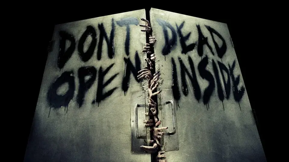
Here’s a look at some marketing fails reminiscent of the “Don’t Dead Open Inside“ design that went viral on Reddit and has become a motif in marketing and design communities.
1. Turkish Airlines ad placement fail
This isn’t bad design or bad copywriting without context – it’s the placement that makes it a design fail!
This Turkish Airlines ad probably would have worked better anywhere else. As a user pointed out in the Reddit comments, it’d actually be a great design on the other side of the escalator. But it’s not, and it’s a pretty big marketing fail for an airline to be associated with a nose-dive.
It’s one of my favorite bad branding examples because the designer and copywriting really can’t be blamed for it. But, let’s move on to some examples of design fails and have a good laugh.
2. Twitter rebrands as X and the design causes confusion
Now that Twitter has rebranded as X, people are pointing out that multiple notifications from the app are spelling out “XXX,” which denotes something most people aren’t going for when they think of social media.
This is a fun example because the logo design, when stacked in notifications tabs, creates unintended copywriting.
Here are a few reactions from users of the app formerly known as Twitter:

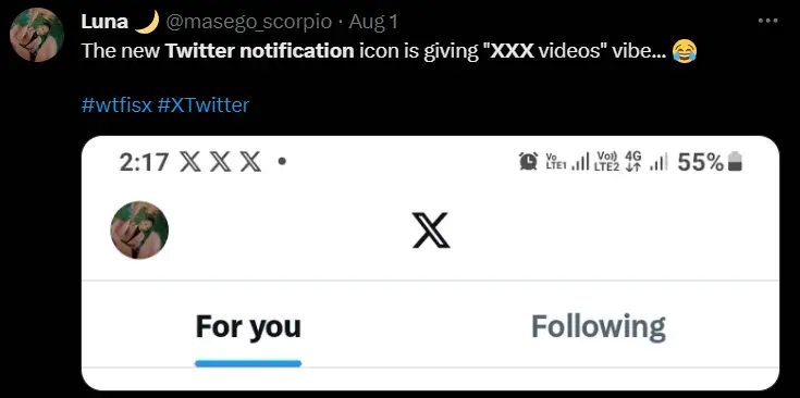
When Twitter first rebranded to X, thousands of people were calling out the marketing fail. But hey, it was a trending topic!
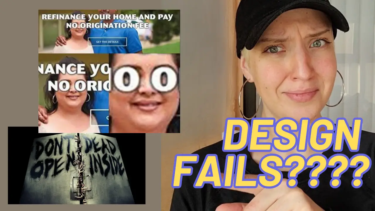
3. Real estate marketing fail… or success?
Real estate marketing can be dry and boring, so let’s applaud this lender for its unique content and careful design.
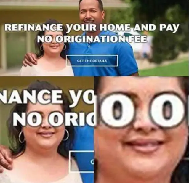
Not sure who is to blame for this – is it responsive web design? The graphics designer? The copywriter with purposeful wordsmithing? But whether you see it as a brand failure or success, there’s no denying it is an attention-grabber.
4. Bad copywriting happens when you skip proofing.
Hold on… visitors WHAT?
This hilarious marketing fail from Visit KC makes a critical typo in the word “annually,” and changes the copywriting message entirely.
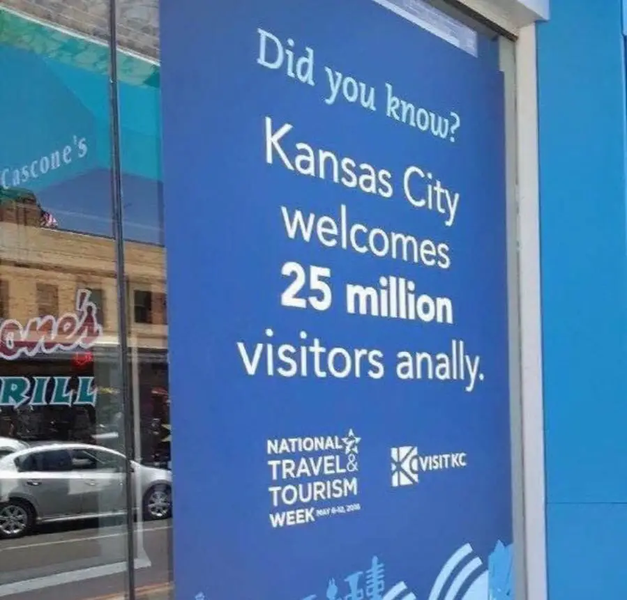
At least, we think it’s a typo.
If nothing else, it’s a great reminder that great copywriting comes with great editing and proofing.
5. The “drowning lol” design failure
This sign appears to read “If you see someone drowning lol call 911.”
The “lol” is supposed to be a person with their arms in the air, but the minimalist graphic design placed in the middle of the message is confusing.
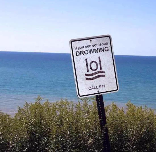
Nothing a quick design swap can’t fix! And maybe the “Call 911” text should be a bit bigger on the next version.
6. The unmotivating “Don’t Be Happy Worry” shirt
As a joke, this is great copywriting and design combination. But, in terms of getting the quote right or trying to motivate someone, this is a fail.
The good news is that they come in different colors and sizes! (The above is an Amazon affiliate link)
7. When the graphic designer never gets the marketing copy
A single marketing campaign has a lot of moving parts and multiple people are involved. In this billboard fail from TireDiscounters, it seems like the marketing copy never made it to the graphics designer.
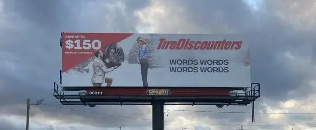
I wonder if marketers drove by this and had a good laugh to themselves. Or, maybe it’s a powerful statement that a picture is worth more than the words that would fit on this ad (I’m trying to be positive!)
8. There’s no place like….. WHAT?!
Probably should rethink this color palette before we make more of these “home” rugs. Without the “m,” it looks like a totally different word.

Imagine getting a picture of this with every DoorDash drop-off confirmation. It’s a design fail that could bring laughs for many months with its accidental copywriting goof.
9. REALLY Bad Copywriting. Cute Design.
We’ve been really hard on the designers so far, but this one is all about bad copywriting. It seems like the title writer didn’t understand the assignment.
The design is doing some heavy lifting for the unintended message.
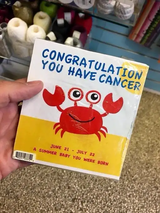
It’s a relief the subtext is here to help us all understand why the crab is so happy about this news.
10. The Jeopard – Copywriting mistakes that almost work
This design for a kid’s puzzle uses “Jeopard” for the letter J.
Judging by the long “J” and the lowercase “c” and “k” in the other two visible examples, it looks like the copywriter made a mistake.
So, leopard became “Jeopard” to match the design work.
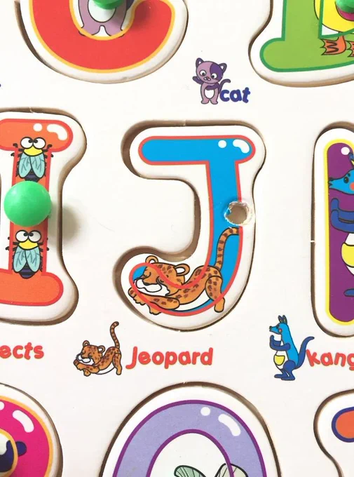
Interestingly enough, there are jaguar and leopard Panthera hybrids. However, the portmanteau naming conventions for these real-life mammalian hybrids do not include “Jeopard.”

Marketing Gimmick or Gaffe? What’s the takeaway?
While most of us are reading this casually to have a laugh, there’s a great takeaway here for anyone interested in marketing and messaging. A typo or design mistake can make people stop to look more than they would look at a perfect ad. To close this list out, I want to leave you with a comment on the “Don’t Dead Open Inside” picture that’s become a meme. I hope it encourages you to create and take action without self-limiting beliefs.
Comment
byu/SmokeyPeanutRic from discussion
indontdeadopeninside
I hope you enjoyed this post. I love to share fun content that helps educate and inspire just like this. You can follow and chat with me on Facebook!
