Yes, Facebook has a new logo and a new shade of blue as their primary brand color. Changes took effect this Thursday (9/20/2023). This brand redesign has been in the works for several months and is only the first phase of what’s in store.
Here is a before and after of the Facebook logo change:
Facebook changes the logo typeface
Facebook uses its own custom typeface, Facebook Sans, across the platform. But until now, the “f” and “Facebook” logos were inconsistent with this typeface. These subtle design changes bring better cohesivity and legibility to the platform.
Facebook rebrands with a new blue color
The new Facebook logo uses a blue color with Hex code #316FF6. You’ll notice that this blue is now the primary brand color across the Facebook platform.
But that’s not all. Facebook has introduced an entirely new color palette. With a set of secondary blues, the goal of Facebook’s design team was to increase accessibility while staying true to the marketing association between Facebook and the color blue.
Why is Facebook rebranding?
It’s not unusual for companies to do rebranding. In fact, many of the brands we see on store shelves and online change subtle things about their branding overtime. But in the case of a strategic brand redesign, there are always reasons underlying the move.
In a LinkedIn post, Dave Nguyen, Design Director at Meta, describes the reason Facebook is rebranding:
“We wanted to ensure that the refreshed logo felt familiar, yet
Dave Nguyen – Design Director at Meta
dynamic, polished and elegant in execution. These subtle, but significant changes allowed us to achieve optical balance with a sense of forward movement.”
Facebook’s Design team cites 3 primary drivers behind their brand redesign strategy:
- Refresh the platform by redesigning iconic elements
- Unify the brand for product-to-marketing experiences
- Anchor the brand color palette around the core blue while optimizing for accessibility
Though we are only in phase one of the brand refresh, the appearance and identity changes are apparent. I personally think they are clean and cohesive and am excited about improvements to icons and emoji reactions (maybe we will finally get new react options!).
Though I haven’t seen any clues about specifics for the next phase of Facebook updates, I will continue to share what I discover on my own Facebook, so be sure to give me a follow over there.
Key Takeaways from Facebook’s New Brand
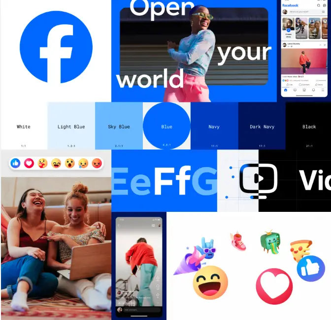
Facebook’s new mood board is centered around a simple, clean appearance and multi-modal interface for social interactions. With improved reactions and expressive emojis, an emphasis on media like pictures and video, and a unified typeface that is globally accessible, Facebook might be aiming to win back some market share from competing platforms like TikTok and X (formerly Twitter).
I’m sure you’ve heard at least one person mention they don’t use Facebook anymore or heard someone describe the comments section of local news articles as some kind of bullpen. Facebook might be on its way to reclaiming its reputation as an app for cool kids as it once was. You might remember that the Threads CEO recently stated it’s goal for Meta’s newest app was for anything but politics to be the platform mainstay.
It’s worth closing this article with a look at Facebook’s future. In their own words, “Our focus remains on creating people-first experiences to help others make progress on the things that matter most to them.”
What do you think of these changes? Are they too subtle? Just right? Not enough? I love to hear how brand design is uniquely interpreted by others.
I hate the new color and feel like it’s a waste of time snd energy that should be invested in making my news feed more interesting and relevant and less repetitive and definitely less Sponsored!